
It’s Rainbow Time!
I don’t think it’s a coincidence that this post happened to fall under Pride Month – so let’s celebrate with a little rainbow!
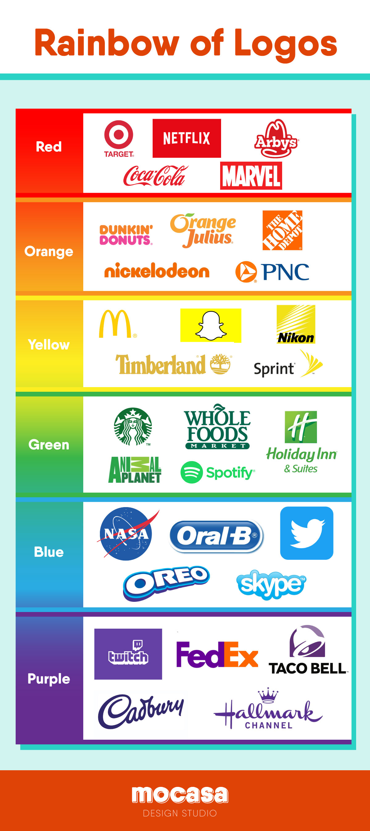
Each of the companies above almost assuredly has a marketing team that decided why their logo looks the way it does. Some of the choices are obvious… of course Orange Julius would have an orange logo because of their signature drink. And of course McDonald’s famous golden arches reminds us of their delicious fries. But why did Twitter choose blue? In fact, why are a lot of social media sites blue?
Well, according to BluLeadz, blue is seen as a color that is calming and relaxing. It represents communication and professionalism. All genders seem attracted to the color blue, which makes it great for a website that wants to connect everybody. There’s also a theory I find both plausible and hilarious, which is that since blue light can keep people awake, social media sites want to enforce that to keep you scrolling through your feeds all hours of the night. Maybe this is anecdotal, but I’ve definitely been there.
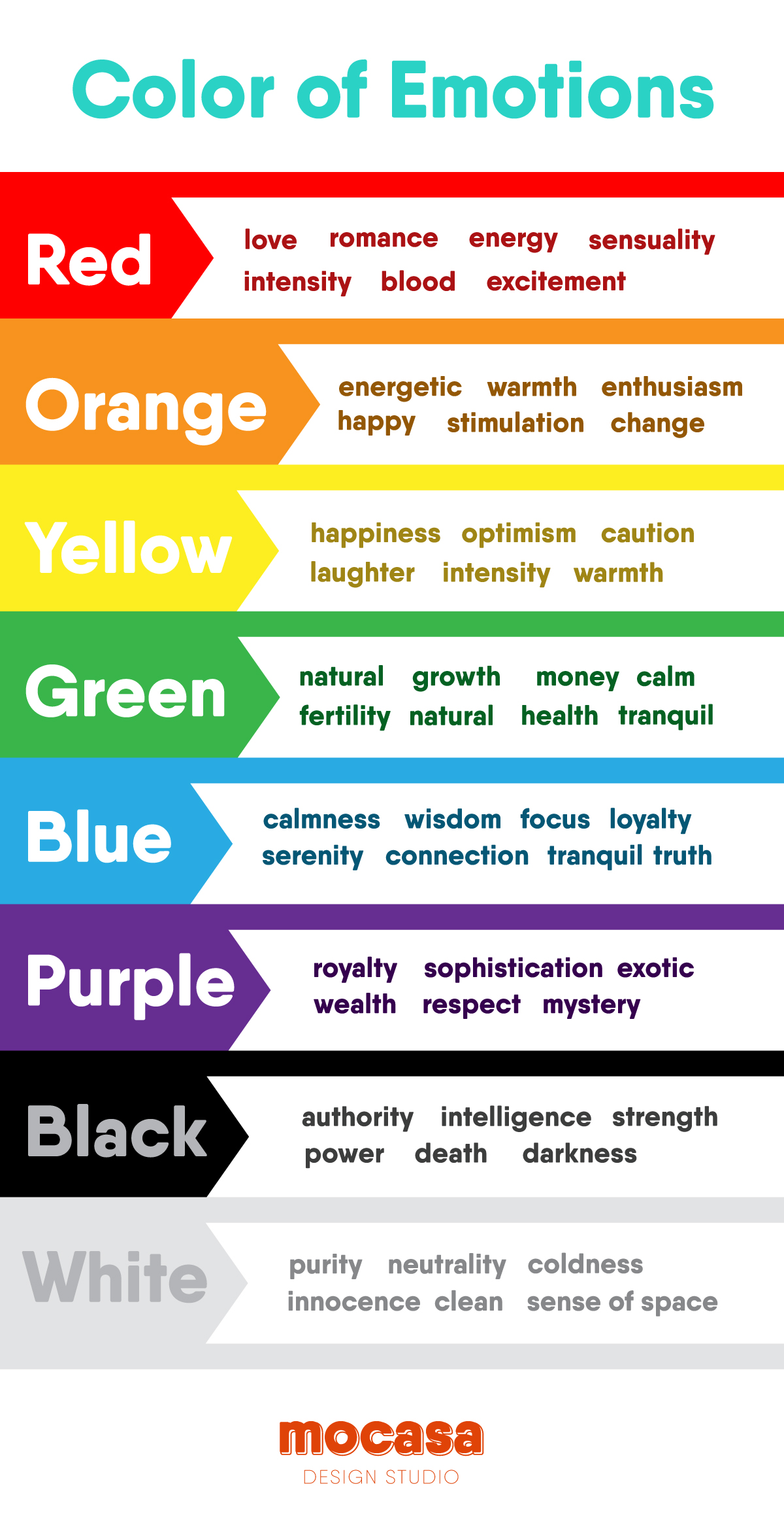
There have been a number of studies on the relationship between color and emotion, and it’s important to take this into consideration when creating a brand. Do you want your brand to be seen as happy? Calming? Sophisticated? Check out the graphic below to see what the most common color associations are.
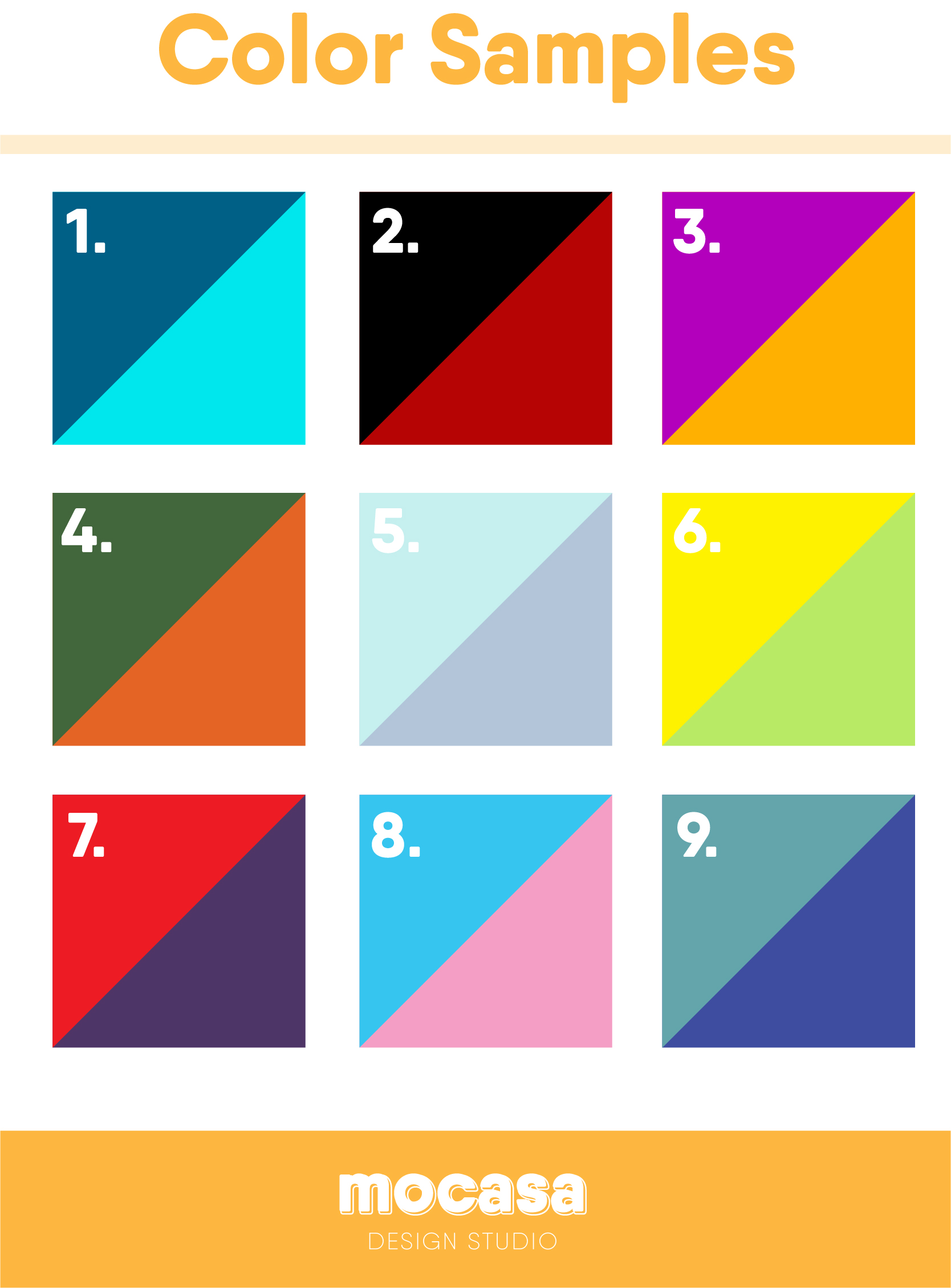
So let’s play a little game! Take a look at the graphic below, and try to really look at each color combination. What type of company does each one remind you of? Can you see #2 as a fast food place, or would it be better as a sophisticated restaurant? Is number #8 a construction company, or an ice cream shop? You can begin to see how the colors bring you a feeling that matches the company it’s representing.
Choose Your Colors Wisely
Practicing seeing colors and how they would fit into a company’s identity is a great way to develop your eye for branding. All companies have their reasons for choosing the colors they do, but thinking about how colors come across to the average person can be a great start in choosing the perfect colors for your brand.