
Have you ever heard the phrase, “it’s not what you say, but how you say it?” That’s how it feels when you have the wrong font for the wrong occasion. You may think that choosing a font isn’t an important part of the branding process, but it can make or break the style you’re trying to set. If you choose the right font, your brand personality can become crystal clear to your customers.
To start out, let’s take a look at some different styles of fonts:
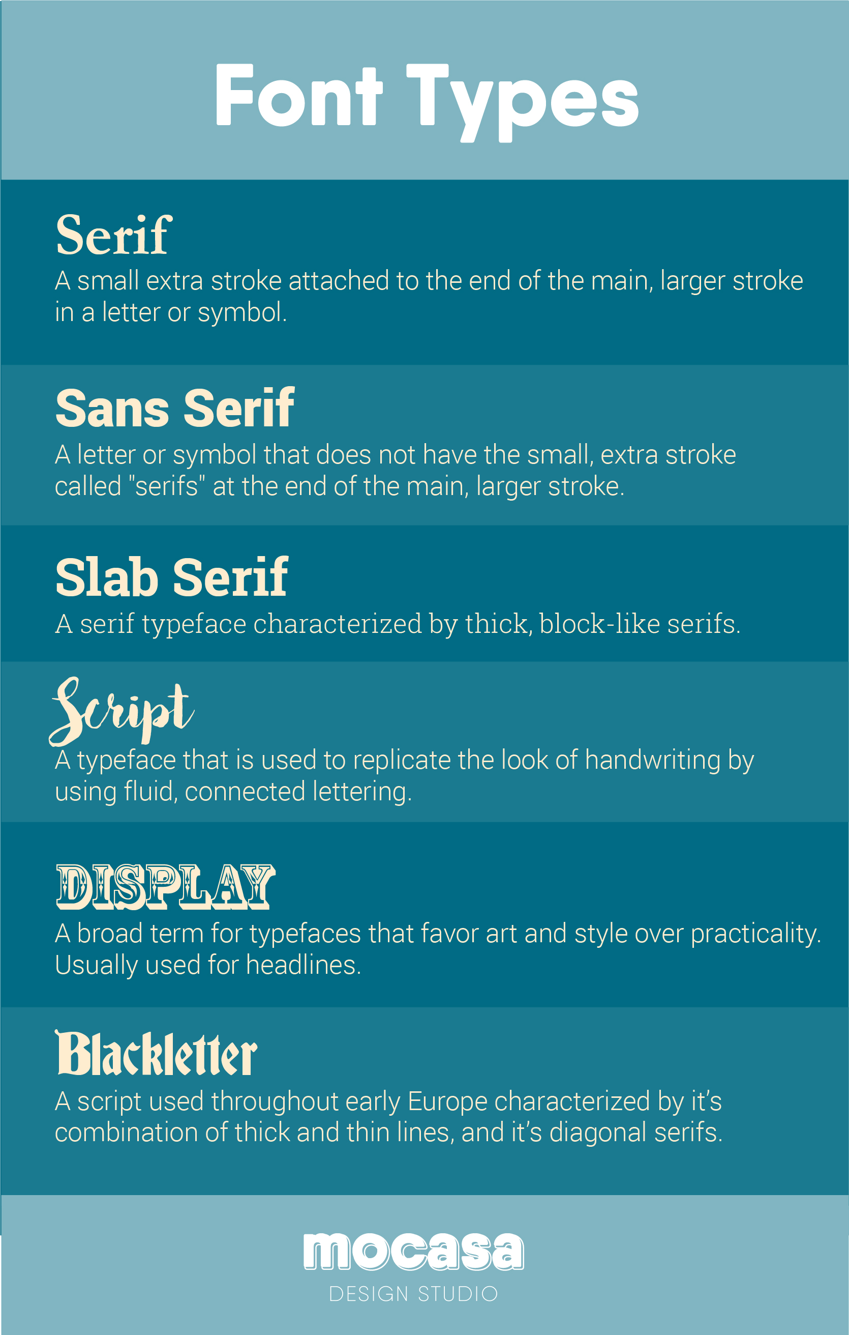
There are even more classifications than this, but these are more of the common ones you’ll see. Even with just these six styles, you can do so much by combining two or three together to create your own unique look.
How To Combine Fonts
Usually you’ll want more than one font to use in your brand. Take a look at my logo, for example. I used a display font for the word “Mocasa” but a sans serif for “Design Studio.” The trick to combining fonts is contrast. You’ll never want to combine two sans serif fonts – like Arial for the heading and Helvetica for the subheading- for a brand. They’re too similar, and it will look like you don’t really know the difference. But, if you choose two different styles – like a script heading and a sans-serif subheading, it will look distinct and attractive.
One of the most standard methods of combining fonts is Serif/Sans Serif.
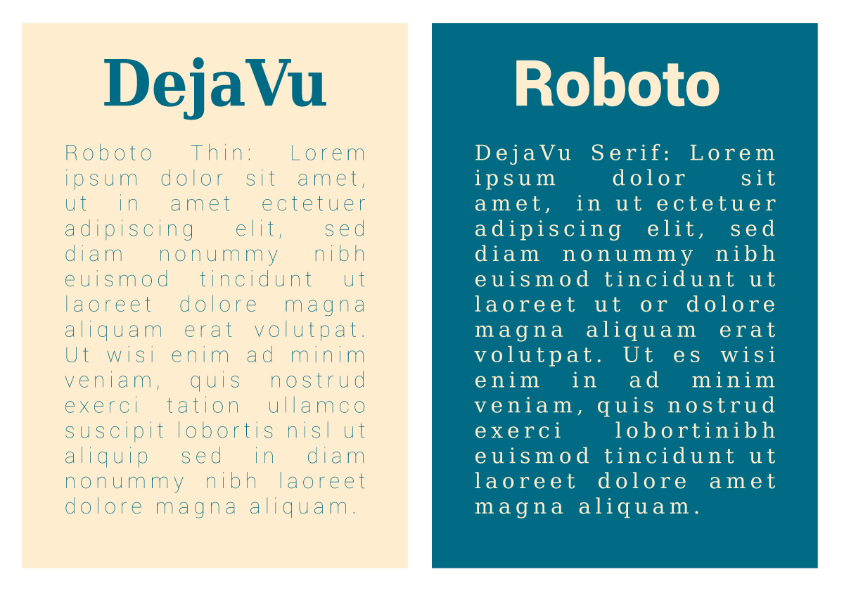
This is a classic way to show differentiate between the heading and copy, and both of these would be great to use. Since the anatomy of both seif and sans serif are different, yet they’re both simple enough to read clearly, using these two styles together is a great way to elevate your design while keeping it clear and readable.
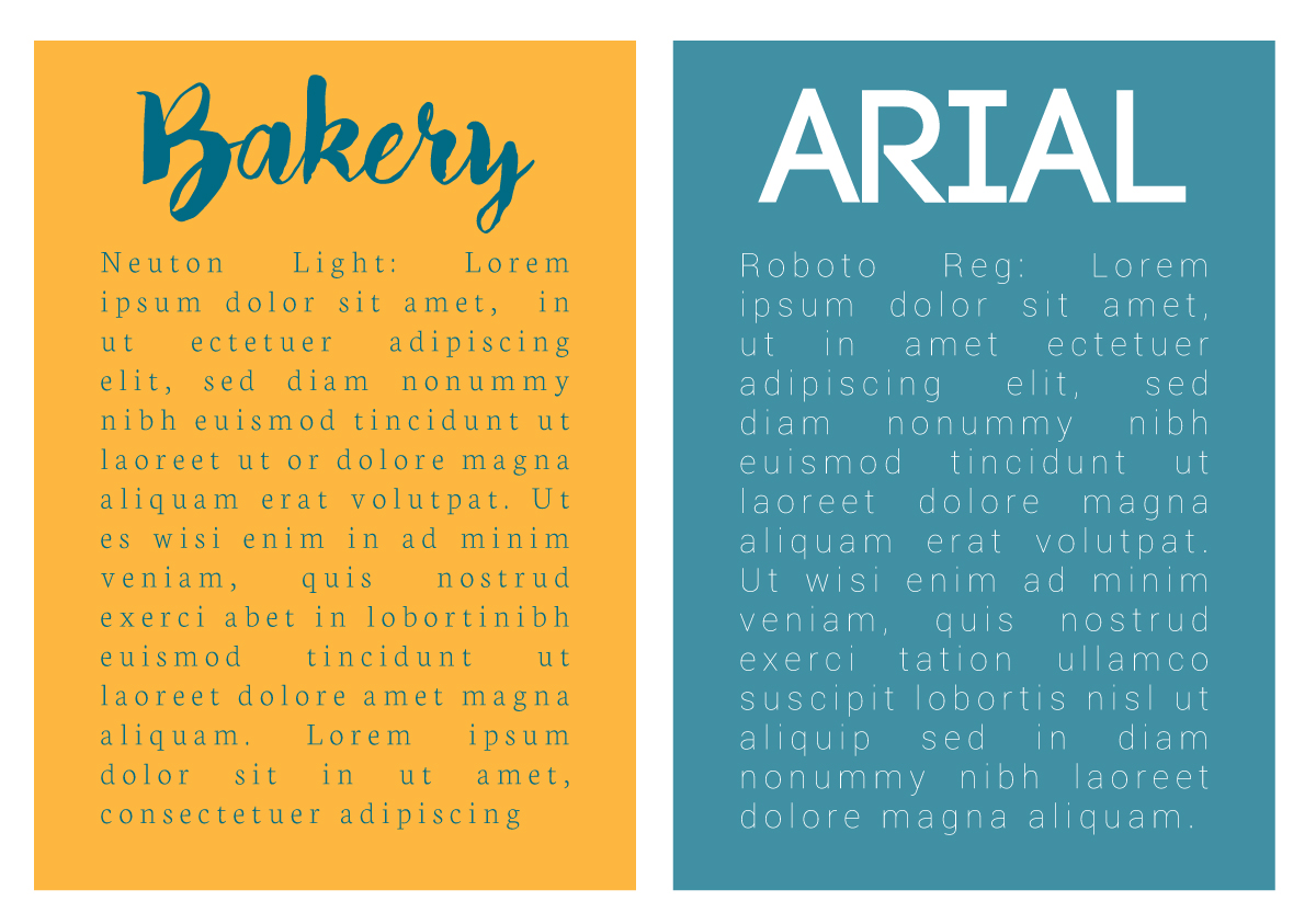
If you want something a little more fun, check out the examples above. To the left we have a script font with a serif font. To the right we have a display font with a sans serif font. The important thing to remember is if you have a more interesting font, you never want to use it for the body copy. Our eyes can only handle intense styles for a short period of time – 1 to 5 words would be a safe bet. But when you start using full sentences with display fonts, it can be very illegible and the reader will give up.
Some Tips
Use Contrast
The number one important thing to remember: contrast. I am reiterating this point because it’s the really the whole point to using two fonts!
Use the same font family
Some fonts, like Roboto, has a whole family with many different fonts that work very well together. Sometimes just by using one font family you can have a serif, sans serif, black, light, and regular – all designed to work cohesively together. It’s a great option if you’re just starting out.
Stay Consistent
I often see brands using all sorts of different fonts depending on the situation. It’s easy to want to change it up and use a different font, but it’s very important to choose your fonts ahead of time, and use only them. Just like when you pick colors: when you stick to the same ones, your brand identity will look cohesive. So choose your fonts, and stick with them!
Use at least one web font
The last thing you want is to choose a font, and then realize it’s not available to use on your website. If you want your brand to be consistent online and offline, it’s important to choose a font that is available on all platforms. Using Google Fonts is a great way to do this: it gives you a full database of what is available where, so you can make sure your style matches across the board.
Final Thoughts
While choosing fonts might seem boring compared to the other brand identity stuff, it’s an important key in making sure your brand is legible and cohesive. So if you take a little time to choose 1-3 fonts, and stick with them, your brand will improve exponentially!